
One of the most common weaving questions we receive at Tierra Wools is “How do I pick out my colors?” Or, more often, “How did you pick out those colors?!?” While developing color sense takes time, practice, and experimentation, there are ways to make the process easier as you learn.

A color wheel is one of our favorite tools for choosing colors that look great together. By looking at a color wheel (there are many, many images of color wheels available online) and applying any one of the following four easy techniques, you can easily select your own harmonious hues for your next weaving.
Technique 1: Triad Colors
Triad colors are three colors that are equally spaced from each other on the color wheel. You can find them by visualizing or drawing a triangle on your color wheel. One of the most well-known triad color combinations is the primary colors: red, yellow, and blue.

Technique 2: Complementary Colors
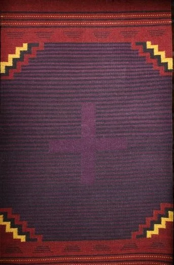
Complementary colors are colors that are located directly across from each other on the color wheel. Classic complementary color combinations are often found in sports team logos (like the Minnesota Vikings - purple and yellow, or the Detroit Tigers - blue and orange) and in the traditional festive Christmas combination of red and green.


Technique 3: Analogous colors
Analogous colors sit next to each other on the color wheel. These combinations are pleasing because adjacent colors are members of the same color families. Think reds, oranges, and yellows of a sunset, the dark blues and violets of storm clouds, or the verdant greens and yellows of springtime foliage.


Technique 4: Tetradic Colors
Tetradic colors simply means four colors, two pairs of two complementary colors. On the color wheel, these four colors often form a rectangle or square shape. When using this type of color scheme, it’s often a good idea to allow one color to dominate so the overall effect of the piece isn’t overwhelming.


We hope these easy color wheel techniques will help you feel more confident when choosing the colors for your next weaving - and perhaps inspire you to try a bold, new-to-you combination! But remember, the color combinations these techniques suggest are just that - suggestions only. The best color scheme for your next project is a scheme that you love, so don’t be afraid to select the colors that speak to you and help you express yourself in your work. That’s what makes your weaving creation a unique expression of you!
Got a special color scheme you love? Share it with us on Instagram @tierra_wools_nm or email us at tierrawools@gmail.com.