Choosing colors can be one of the most enjoyable and delightful steps of the weaving process. Color allows us to add personality and panache to a piece, to make a statement and delight the senses. For some, however, color selection can be an intimidating choice, especially when there’s a such a variety of hues, shades, tints, and tones to choose from. We’ve all had the experience of selecting colors that look distinctive next to each other in skeins but seem to blur together in the finished piece. Why do some color combinations pop in one design yet fall flat in another?
First, a few basic color definitions. Hue describes any pure color, containing no white or black. A tint is a hue (pure color) with white added. We often think of tints as pastel colors. Then there are shades: hues with black added. And finally, there are hues with gray (both white and black) added to them and these are called tones.
Here’s an example at left of a hue, tint, tone, and shade in blue (from left to right).
So how will this knowledge help you choose better colors for your weavings? Yarns that contain similar amounts of white, gray, or black will meld together, creating a mellow, blended look, while colors that contain different amounts of white, gray, and black, will stand out from each other with clear definition. When designing a pictorial tapestry, for example, using yarns with similar tones helps to create texture in the landscape and create a mood in the weaving. A geometric design, by contrast, benefits from yarns with varying levels of tone so that the design vividly stands out.
“But how can I know how much white, gray, or black is present in the yarns I’ve selected?”
Take a photo of your yarns and look at it in grayscale! This is the best, fastest, and easiest way to discover how much contrast – or lack of contrast your yarns actually have.
In this example of a hooked rug, the similar tone levels allow for delicate shading in the detail of the leaves and flowers.
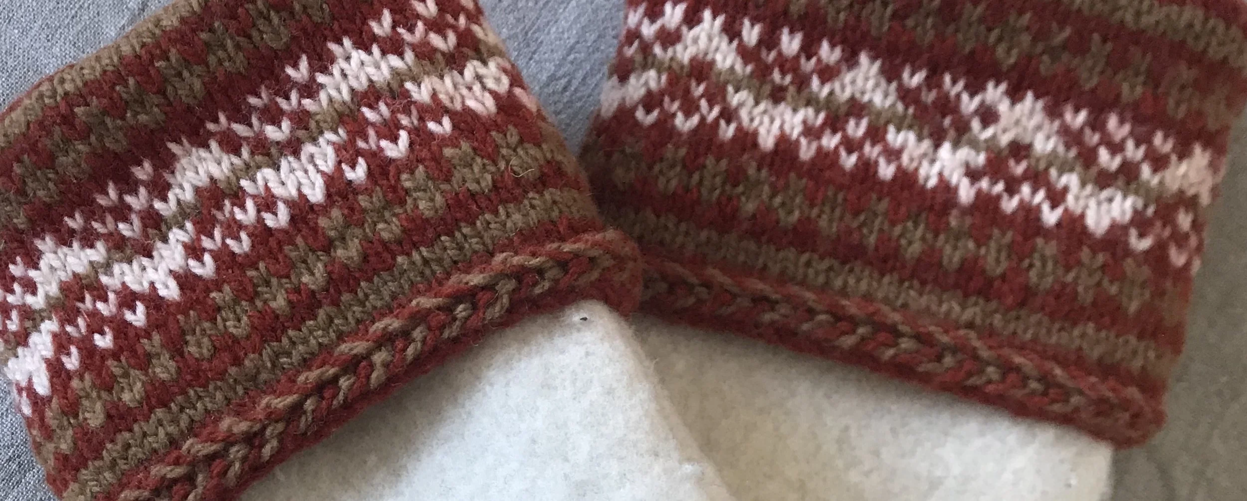
In this knitted example, notice in the color example how the geometric design lacks sparkle and how the lack of contrast is evident in the grayscale photo.
Think colors within the same family are off limits? Look at the fantastic contrast of these sunny hues in color and in grayscale.
Take a look at our wall of yarn – and notice the tones in grayscale. Does this change your perception of colors that work together?
We hope this brief dive into hue, tint, tone, and shade helps build your color confidence when designing your next weaving. For more information about choosing colors, read our first blog on color, Color Sense (Part 1) where we discuss using a color wheel create bold, beautiful color schemes for your next weaving project.


